The Visual Significance of Color
)
Color plays a vital role in establishing mood and creating ambiance. Influencing us both psychologically and physiologically, color is the most important design element in reflecting mood and style, helping us switch between modes, matching and influencing our sense of vitality or composure throughout the day. From colors that express feelings of nostalgia, convey positivity or make us feel strong and powerful, to those which are calming and meditative, softly soothing or satisfy our need for grounding and greater warmth, every color or grouping of colors tells a story, evoking feelings and influencing our emotions and perceptions.
Color evolutions
Movements in color continually evolve, inextricably connecting us to the culture at any moment in time. Trends in color also go forward, adapting to meet the future shifts within a marketplace and the constant changes in consumer behavior. Today as we experience great social and technological transformation resulting from a life changing global pandemic, we are living our lives very differently than in the past. Our ability to physically interact with others has been limited and our homes, the one place where we can feel completely safe, has taken on a completely new meaning. Social unrest is also acting to influence future trends in color, as consumers turn to colors that empower and embolden as well as protect and foster feelings of resilience.
The relationship between color and the now
As our worlds become simultaneously smaller and bigger - as we live more locally and experience the wider world digitally - there is no question that this is influencing the colors we are seeking out as well as our design process. At the same time, what we are seeing is not so much a seismic shift in our approach to color as much as an acceleration of many of the design trends that were already emerging.
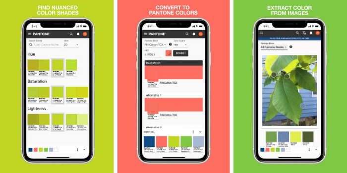
On the manufacturing side, calls for a more sustainable process were already focusing our efforts to become more digital. By limiting travel and direct physical interaction, the pandemic has further enforced this change. Designers are now requiring a more convenient and simplified color process, one that seamlessly integrates physical and digital design tools including Pantone Connect.
Future color trends
Looking through the lens of color to future color trends, these emerging new trends were considered in the new colors we recently added to our different Pantone color system palettes, new colors that both reflect and will shape future color and design direction.
Standing for purity and brilliance, whites are expanded into warm and cool tones. Delicate and floral, Baby’s Breath and Summer Sand bring softness, whilst bright Lucent White stands out amongst creamier shades.
The appeal of the browns has widened as we appreciate the significance of our earthly heritage and primordial beginnings. Emblematic of wood and craft, browns grow more beautiful as our thirst for authenticity grows. Browns fall into earthy and organic shades through to luxurious russet and red-based shades bringing greater depth of color.
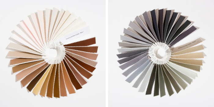
As circularity and sustainable economy grows more important, minimalist beige and taupe hues come to the fore. Neutrals offer endless subtleties depending on the hues or the undertones they touch. New colors, Weathered Teak, Island Fossil and Fields of Rye, speak to the need for what is organic, whilst Savannah Tan and Trench Coat, express an ongoing demand for more classic shades.
Enduring gray no longer sits in the background but can instead make its own strong statement. Emphasizing the strengthened position of the grays, we added a wide range of gray hues, from the quieter Weather Vane and Night Owl to the neutral Silent Storm and through to deeper charcoal shades.
As technology and nature form a new union, we see the relevance of new colors in nature including blacks from the greyed down Black Sand to intensely profound shades like Black Oyster, Volcanic Ash and Unexplored, a few examples of the galactic blacks that add depth to our palette.
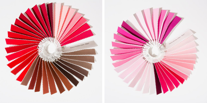
With our traditional understanding of red continuing to broaden, the red family remains vital. Forever associated with passion, the vitality of reds is connected to action from protest to statement to individuality. We welcome these new elements of red in an expanded palette including emphatic and robust reds containing both warm and cool undertones.
An energizing color family, orange continues to captivate. The stars of the orange family are the coral tones leading with the cooler Flamingo Plume and Dianthus while including the warmer Rosette and Murex Shell. Coral Paradise underscores this heated color direction.
Pink embraces new meanings and relevance, taking on a significant role in narratives of protest and empowerment, spirituality and wellness. Today’s pinks are lifestyle colors, crossing genders and generations. Because of their association with positivity, good health, well-being, softness and compassion, all key issues of this new decade, the pinks serve as the cornerstone of our new feelings of pastels. Pinks are a non-divisive color range, a key characteristic at a time when we are craving a message of unity.
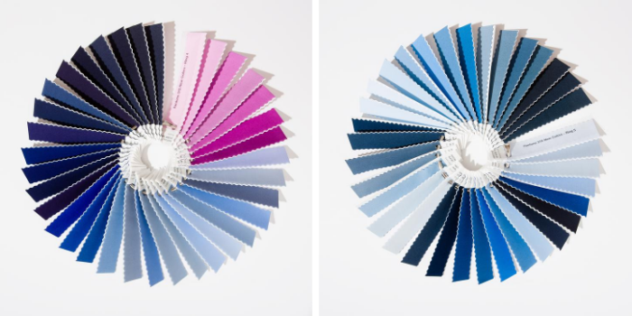
Our attraction to purple suggests our new love and understanding of nature including flowers, which can be seen everywhere from runways to gardens and digital and physical shop fronts. Bringing a sense of beauty, inspiration and joy, purples are a spiritual antidote to our busy and stressful lives. Our new collection of purples reflects the plethora of nature’s florals from First Bloom and Pale Pansy to the lilac tones of Nosegay and Bonbon and the more exotic Cattleya Orchid and Beautyberry.
Our vision of blue is endless; reaching out to the sky for immensely ethereal tones, across the seas where it encompasses all the varieties of water based aqua and turquoise shades, and up through to the galaxy where it speaks to the immensity of the cavernous universe. Becoming more nuanced, we augmented our offering of blues through the addition of varying degrees of icy blues, denim blues, lightning blues and deep classic navies. Cool aqua blues with names like Coastal Shade, Water Ballet and Spa Retreat and brighter turquoise tones, like Splish Splash and Swim Cap take us to tropical islands as do vacation destination green-infused blues including Exotic Plume and Gulf Coast.
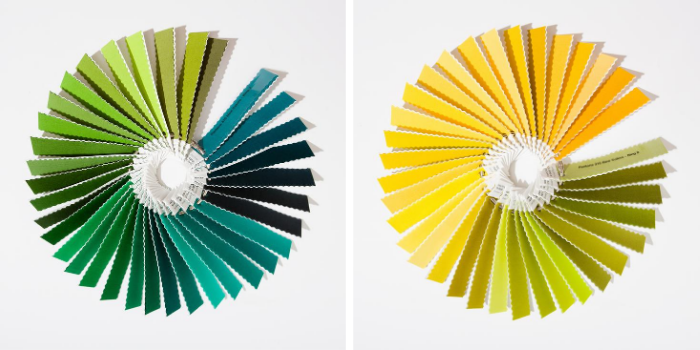
Nature’s crucial role in health and wellbeing has led to a new relationship with the outdoors and the greens we see there. It is the continued influence of the green family that led to the addition of a wide array of green shades ranging from the natural and earthy yellow greens to true green shades. Other important new additions include the herbal gray infused greens like Dried Sage, the warm olive infused Peat Moss and the deep blue influenced greens, such as Spruced Up. Whilst green is a color of our natural world, it also exists in the synthetic world where it infuses a futuristic element, which comes through in citrusy energetic shades.
The addition of sophisticated stratas of yellow highlight our feeling for light effects and gold mineral hues. Yellow’s high visibility value in flower and fruit are also critical to our new enhanced palette which feature some more true yellows, yellows with a green undertone, an array of orange yellows, and some more Dijon shaded yellows to add some extra spice.
Access Pantone Colors across platforms, devices and applications with Pantone Connect. Learn more and sign up for free here.
Our new Pantone Fashion, Home + Interiors formats have been redesigned to best meet your colour needs while streamlining your digital and physical colour workflow. Learn more here.
To hear more from Pantone, sign up to their newsletter here.
Join our exclusive Fashion Together live session with Laurie as she highlights the top color trends for Spring/Summer 2021.
About the author
 Laurie Pressman is the vice president of the Pantone Color Institute, the world's most comprehensive destination to gain intelligence, insight and implications on the science and emotions of color.
